



Hot days, cold thermometers
Posted on 27 July 2026 by Zeke Hausfather
This is a re-post from The Climate Brink
A graph has been making the rounds on social media showing the average number of days per weather station above 95F, 100F, and 105F across the contiguous US since 1895. It comes from CFACT analyst Chris Martz, drawing on raw data from NOAA’s Global Historical Climatology Network daily dataset (GHCNd), and it shows the 1930s towering over everything since. The implication is that extreme heat in the US is nothing new, and that all the recent fuss about record temperatures is overblown.
It is a compelling figure. The 1930s Dust Bowl really was an extraordinary period of extreme heat in the US, and no amount of correction for changes in measurement techniques over time makes it go away. But the graph is also a case study in why you cannot naively count threshold exceedances in raw daily station data and call it a climate record. Its results rest on two well-documented thermometer problems that artificially depress modern hot day counts, plus a station network that happens to be oversampled where the Dust Bowl happened.
To start with, let’s reproduce the figure properly. Rather than averaging whatever stations happen to be reporting in a given year (the station network grew from a few hundred stations in 1895 to many thousands today, with big shifts in where they are located), I selected the 543 GHCNd stations in the contiguous US with long, near-continuous maximum temperature records over the full 1895-2025 period, gridded them to 2×2 degree cells, and computed an area-weighted national average.
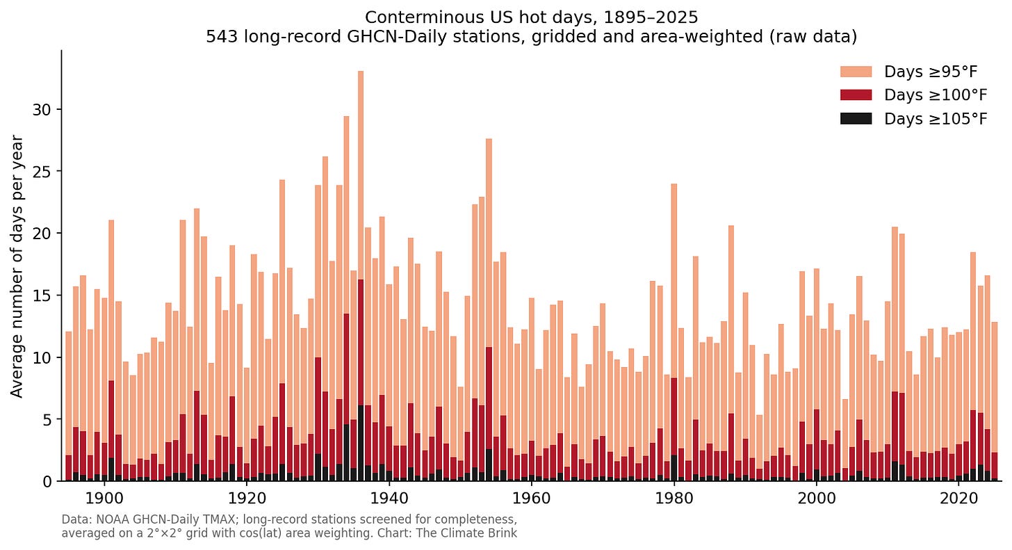
Average number of days per year at or above 95°F, 100°F, and 105°F over the contiguous US, 1895–2025, from 543 long-record GHCN-Daily stations (raw, unadjusted TMAX), averaged on a 2°×2° grid with cos(latitude) area weighting.
Here we see the same basic story as the viral version: a huge spike in the 1930s (1936 alone averaged 33 days at or above 95F across these stations), elevated values through the mid-1950s, and nothing since that comes close. So the Martz figure is not fabricated, and its shape is not an artifact of the changing station network. To be fair to its author, counting hot days in raw data really does produce this picture.
The problem is what “raw” means here.
Raw sounds virtuous, like unfiltered honesty. But the US cooperative observer network has changed in two important ways over the past century, and both changes bias hot day counts downward in recent decades relative to earlier ones.
The first is time of observation bias. Volunteer observers read and reset their max/min thermometers once a day. In the early 20th century most did so in the late afternoon, near the hottest part of the day. An afternoon reset means a very hot afternoon can get counted twice: once for the day it happened, and again the next day if the following afternoon is cooler, since the thermometer still holds yesterday’s peak. Over the 20th century the network gradually shifted to morning observations (better for measuring precipitation), which does not double count heat. Vose et al (2003) documented how this shift alone imparts a spurious cooling trend of a few tenths of a degree in US records, and the double counting directly inflates hot day counts at afternoon-observing stations.
The second is the thermometer switch. In the mid-1980s NOAA replaced liquid-in-glass thermometers in wooden Cotton Region Shelters with electronic maximum-minimum temperature sensors (MMTS) at most cooperative stations. Quayle et al (1991) showed the new sensors read maximum temperatures around 0.4C (0.7F) cooler than the old shelters. This produced a one-time step change at thousands of stations that landed right at the start of the modern warming era. When your threshold is a hard cutoff like 95F, a step down of nearly half a degree C removes a lot of days.
Homogenization algorithms (like NOAA’s pairwise method, Menne and Williams 2009, or the Berkeley Earth approach, Rohde et al 2013) detect and correct these breakpoints by comparing each station to its neighbors. Our 2016 paper validated these adjustments against the pristine, purpose-built US Climate Reference Network and found they perform well. While NOAA does not have daily homogenized data (they only provide monthly homogenized data), Berkeley Earth does. So let’s compare the raw hot day count to the same metric computed from Berkeley Earth’s homogenized daily maximum temperature fields.
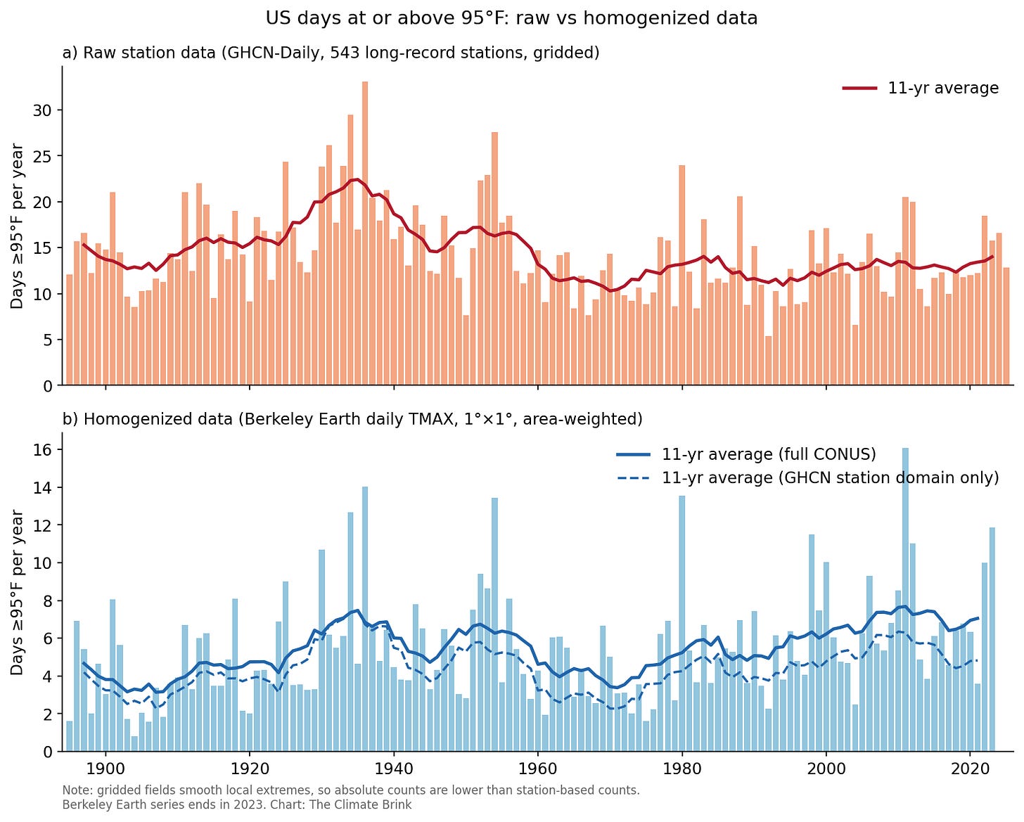
Days per year at or above 95°F over the contiguous US. Top: raw GHCN-Daily data from 543 long-record stations, gridded and area-weighted. Bottom: Berkeley Earth homogenized daily TMAX (1°×1°, area-weighted over CONUS), with the dashed line showing the same calculation restricted to the grid cells containing the long-record stations. Absolute values differ because gridded fields smooth out local extremes; the shapes are the meaningful comparison.
The two datasets agree that the 1930s were exceptional. Where they disagree is the modern era: in the homogenized data, recent decades rival the Dust Bowl years CONUS-wide, with 2011 (16.1 days) actually edging out 1936 (14.0 days) as the biggest year in the Berkeley Earth series.
We can make the comparison cleaner by putting each series relative to its own 1951-1980 average:
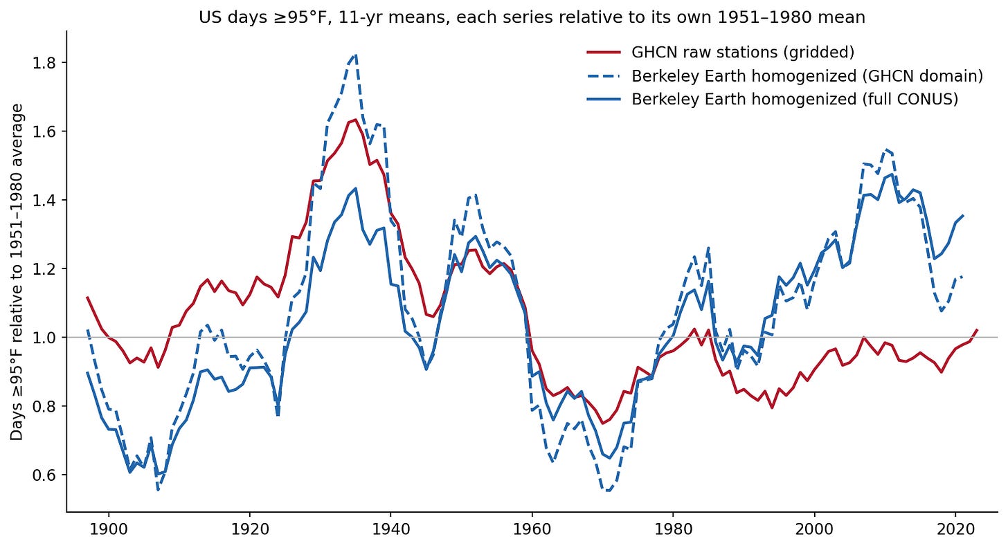
Days ≥95°F, 11-year running means, with each series shown relative to its own 1951–1980 average. Red: raw GHCN-Daily long-record stations. Blue solid: Berkeley Earth homogenized daily TMAX over the full CONUS. Blue dashed: Berkeley Earth restricted to the grid cells sampled by the long-record station network.
The raw and homogenized series track each other closely for the first 85 years, through the Dust Bowl peak and the cool 1960s and 70s. Then, right around 1980 (just when the MMTS transition began), they split. The homogenized data rises to around 1.4 times its mid-century baseline while the raw data stays flat at roughly 1.0. The raw data does not exaggerate the 1930s, but rather erases the last 40 years of increases in extreme heat.
The dashed and solid blue lines in the figure are also worth a closer look. The dashed line averages the Berkeley Earth data over only the 130 grid cells where our long-record stations actually sit; comparing it to the raw series is the fair like-for-like test, since the places are the same and data adjustments are the only difference. The solid line averages over the whole country, and the gap between the two exposes a sampling problem rather than a data problem. Century-old stations cluster in the Midwest and East, which is precisely where the 1930s heat was centered and where extreme daytime heat has increased the least since. Averaged over the long-lived station locations, even in homogenized data, puts the 1930s roughly 45% above the last two decades. If we average over the full contiguous US, however, that gap shrinks to about 10%.
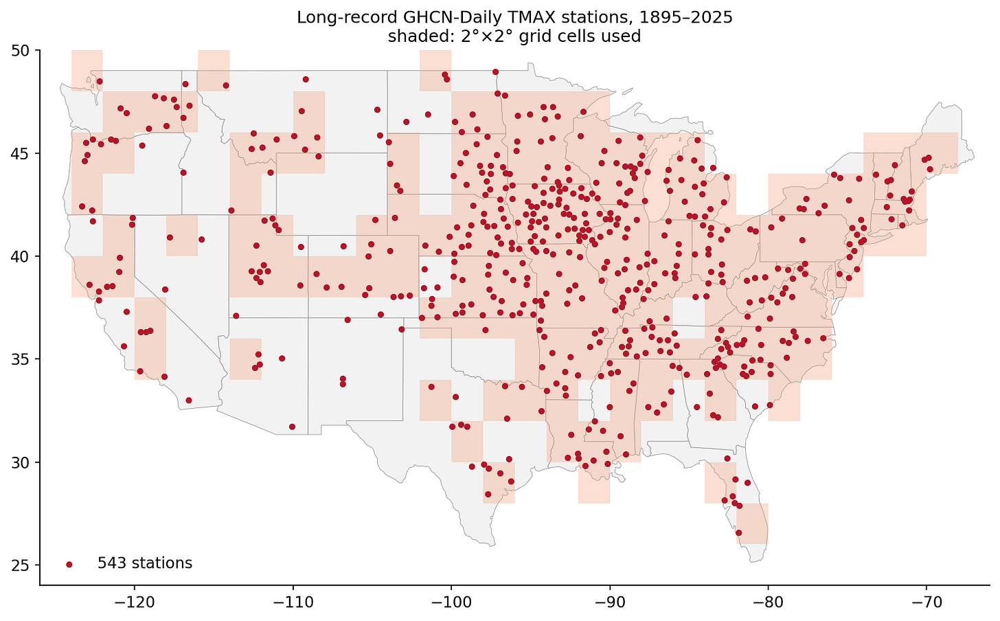
Locations of long-lived weather stations used in the reproducing the viral Martz figure. Note that these tend to oversample the Midwest region where dust bowl temperature extremes were most pronounced.
There is a second, subtler issue with interpreting the viral graph: geography. Long-record stations are heavily concentrated in the Midwest and East (only 116 of our 543, around a fifth, sit west of 100W), which happens to be exactly where the 1930s heat was centered. Let’s break the country into NOAA’s nine US climate regions and look at each one separately, using the spatially complete Berkeley Earth data.
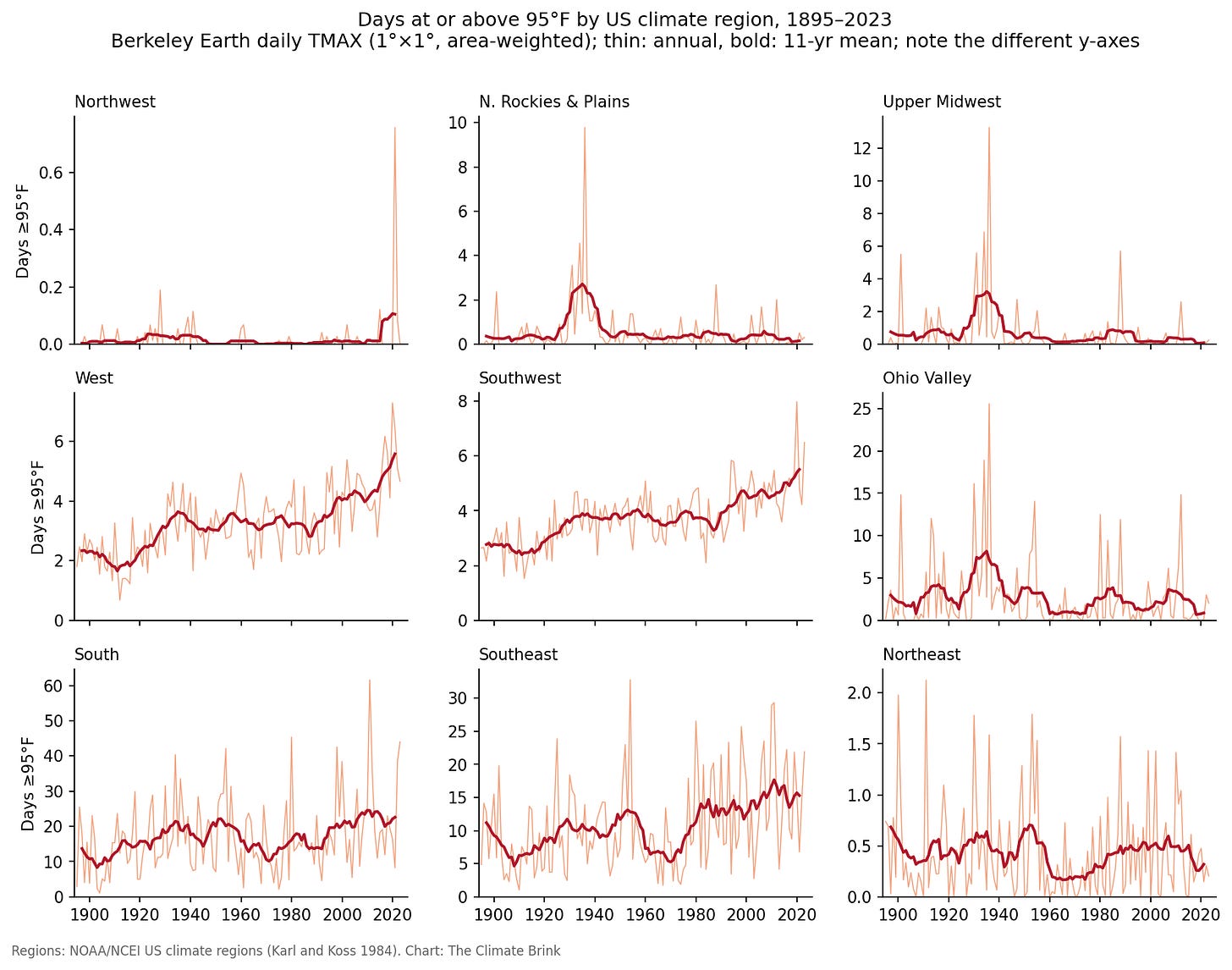
Days per year at or above 95°F for each of NOAA’s nine US climate regions, 1895–2023, from Berkeley Earth homogenized gridded daily TMAX (1°×1°), area-weighted within each region. Thin lines are annual values; bold lines are 11-year running means. Note that the y-axis scale differs by region.
The Dust Bowl turns out to be a story about three regions. In the Upper Midwest the 1930s averaged around 15 times as many 95F days as the last two decades (3.4 vs 0.2 per year), in the Northern Rockies and Plains around 9 times (2.8 vs 0.3), and in the Ohio Valley around 4 times (8.7 vs 2.1), with 1936 the record year in all three.
Everywhere else the present rivals or beats the past: the South is essentially tied (22.4 days in the 1930s vs 22.7 over 2000-2023, with 2011 the biggest year in the record), while the Southeast (14.7 vs 11.1 days), Southwest (4.9 vs 3.9), and West (4.6 vs 3.6) all see more 95F days now than in the 1930s, with the two western regions peaking in 2020. (The remaining two regions, the Northeast and Northwest, average less than one 95F day per year throughout the record, too few for meaningful comparisons.)
The mid-century spike in that average comes almost entirely from three regions in the middle of the country. This makes physical sense: the Dust Bowl heat was tied to a specific regional catastrophe, a multi-year drought amplified by human-induced land degradation (Cook et al 2009), with bare, desiccated soils driving daytime temperatures to levels those same fields have not approached since. A record set during an ecological disaster in one part of the country is not evidence that the whole country, much less the planet, was hotter. The national chart is really being driven by a distinct regional anomaly.
Finally, it is worth stepping back from the hottest afternoons of the year, which are a noisy, bias-sensitive sliver of the temperature record, and looking at what US temperatures as a whole are doing. The figure below shows annual average maximum, minimum, and mean temperatures for the contiguous US from NOAA’s homogenized nClimDiv dataset.
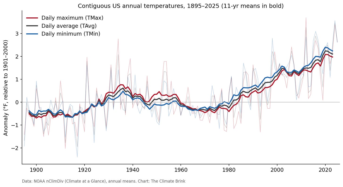
Contiguous US annual average daily maximum (TMax), minimum (TMin), and mean (TAvg) temperature anomalies relative to 1901–2000, from NOAA nClimDiv, 1895–2025. Thin lines are annual values; bold lines are 11-year running means.
All three are unambiguous. Since 1970, maximum temperatures have warmed at 0.52F per decade, minimums at 0.51F per decade, and the average at 0.51F per decade (all p < 0.0001), with the last decade roughly 2F above the 20th century baseline. The 1930s show up here too, but as a modest bump in maximum temperatures far below present (as the dust bowl event was largely limited to summer TMax temperatures, with a much smaller effect on the remainder of the year). Extreme daytime heat in summer is one of the places where the US warming signal is weakest (a real and interesting scientific result, related in part to agricultural intensification and irrigation in the Midwest (Mueller et al 2016), but it is not representative of the climate system as a whole.
One last piece of context. The contiguous US covers less than 2% of the Earth’s surface, and as we saw above, even within the US the Dust Bowl signal is regional. So what does the very same chart look like for the planet as a whole? The figure below reproduces the design of the viral graph (days at or above 95F, 100F, and 105F) using the Berkeley Earth daily data over global land. To avoid mixing climate changes with changes in the locations we measure (global station coverage grew from under 40% of land area in the 1890s to essentially complete today), I restrict the average to the grid cells with continuous century-long records, covering 42% of global land.
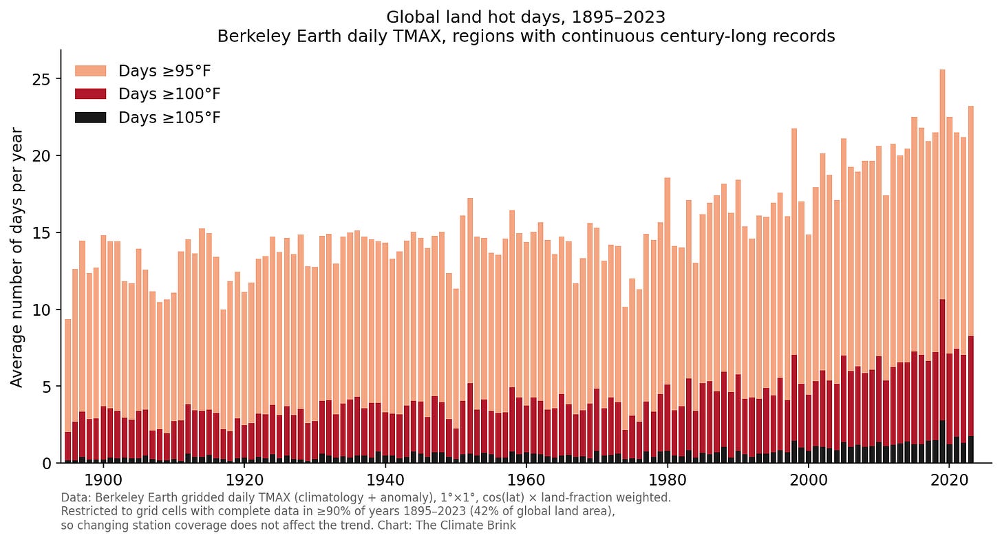
Average number of days per year at or above 95°F, 100°F, and 105°F across global land, 1895–2023, from Berkeley Earth homogenized gridded daily TMAX (1°×1°), area-weighted by cos(latitude) and land fraction. Restricted to grid cells with complete data in at least 90% of years over 1895–2023 (42% of global land area), so that changing station coverage does not affect the trend.
Globally there is no 1930s spike at all: 1936, the year that towers over the US record, comes in at 15.1 days at or above 95F, less than a day above the surrounding years. The Dust Bowl, extraordinary as it was in Kansas, barely registers when averaged over the world’s land. Instead, hot days hold roughly steady until around 1980 and then climb: days at or above 95F are up around 70% between the early 20th century (1895-1924) and the last decade (12.8 to 22.1 per year), days at or above 100F have more than doubled (3.0 to 7.5), and days at or above 105F have nearly quintupled (0.3 to 1.6). The hotter the threshold, the faster the rise, which is exactly what you expect when a whole temperature distribution shifts upward. All ten of the warmest years by the 95F metric have occurred since 1998, and the six most recent years in the series (2018-2023) are all among them.
The US Midwest is one of the few places on Earth where the hottest days of the mid-20th century still stand; picking it as your yardstick for global warming is, to put it charitably, a choice.
First, the Dust Bowl was real, and it remains the benchmark for multi-year extreme daytime heat in the central US, in adjusted and unadjusted data alike. Anyone claiming the 1930s heat is purely an artifact of bad data is simply wrong.
Second, it was a regional phenomenon. Break the country into NOAA’s nine climate regions and the 1930s is only exceptional in only three of them (the Upper Midwest, the Northern Rockies and Plains, and the Ohio Valley, at roughly 4 to 15 times recent levels). The four regions where hot days are the most common (the South, Southeast, Southwest, and West) all match or exceed the Dust Bowl today, with record years of 2011 and 2020, not 1936.
Third, raw daily data is the wrong tool for this question. Time of observation changes and the 1980s switch to MMTS sensors both suppress modern hot day counts relative to the past, and the raw and homogenized series diverge almost exactly when the instrument transition happened. In homogenized data, recent decades rival the 1930s even averaged nationally.
Fourth, hot days above a fixed threshold are a narrow and noisy way to look at the data. The overall US warming trend (around 0.5F per decade since 1970 in max, min, and mean temperatures) is robust in every dataset, raw or adjusted, satellite or surface. And globally, days above 95F have been climbing steadily for a century, with no Dust Bowl bump at all: the central US is one of the few spots on the planet where the mid-20th century still holds the record for extreme daytime heat.
The viral chart is built from real measurements, and the heat it shows was real too. But it takes a regional catastrophe, fails to account for changes in instruments and observation times, and presents the result as a national climate verdict. Accounting for the thermometers and the geography, and the US looks a lot like the rest of the planet: the hottest days on record are increasingly the ones we are living through now.
I’ve included a more detailed writeup of the methods and code to reproduce this analysis on my GitHub here.